5 Diy Paint Ideas That’ll Make Your Walls Go Viral 2026!
Ready to give your space instant personality without selling a kidney? Paint is your budget BFF. It’s fast, dramatic, and way more forgiving than you think. Grab a brush, cue the playlist, and let’s make your home look like you hired a designer—without the invoice.
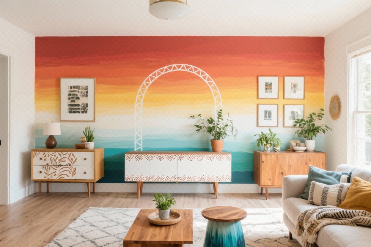
1. The Bold Color Block Glow-Up
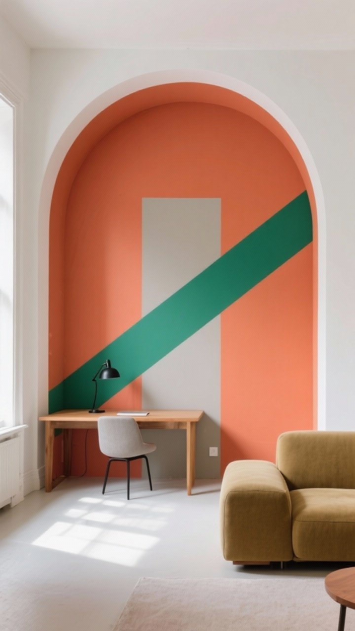
Color blocking is the fastest way to add drama. Pick two or three hues, tape off a shape (arches, diagonals, chunky rectangles), and go for it. It’s like eyeliner for your walls—suddenly everything looks intentional.
Why It Works
- Defines zones: Perfect for carving out a reading nook or WFH corner.
- Low commitment: Hate it? Paint over it. No tears.
- Instant style: Looks designer with minimal effort.
Pro Tips
- Test swatches on all four walls. Light shifts color more than you expect—FYI, beige can go pink fast.
- Use high-quality painter’s tape and press edges with a credit card for razor-sharp lines.
- Seal the tape by painting the base wall color over the tape edge first, then your accent color. Zero bleed. Chef’s kiss.
- Balance the palette: Pair one bold shade (like terracotta or emerald) with a neutral (warm white, greige) so it doesn’t scream.
2. The DIY Limewash Look (Without the Mess)
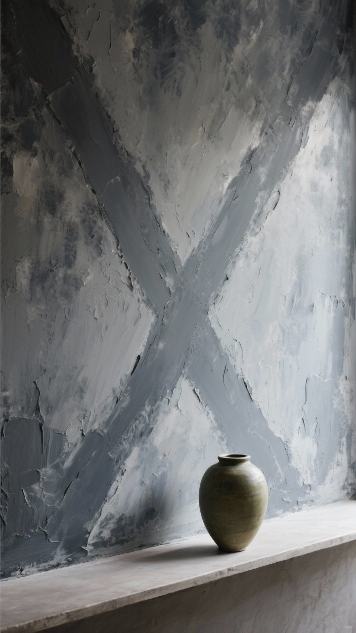
Love that moody, textured European vibe? You can fake a limewash finish with watered-down matte paint and a wide brush. It adds depth, hides wall sins, and makes your home feel like an art gallery that also serves snacks.
How To Do It
- Mix paint: Combine 60% matte/flat paint with 40% water in a bucket. Stir well.
- Brush in X strokes: Use a big masonry or limewash brush and paint in overlapping X’s. Imperfection is the point.
- Layer lightly: Do 2–3 thin coats, letting each dry. The variation creates that cloudy, high-end look.
Shades That Slap
- Warm neutrals: Mushroom, oat, cafe au lait
- Moody tones: Slate, inky blue, olive
Bonus: It’s insanely photogenic. Your selfies will thank you.
3. Thrift Flip Nightstand: The Two-Tone Magic Trick
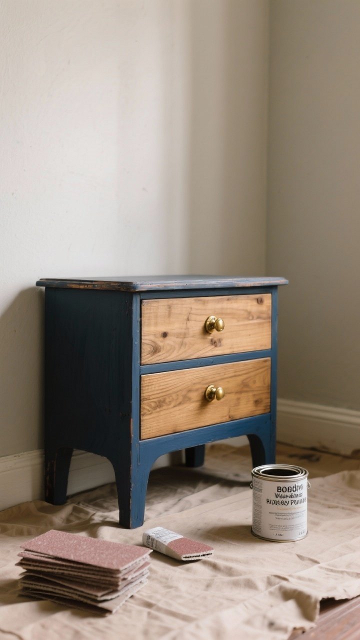
Don’t toss that dated dresser—paint it like a custom piece. A two-tone furniture makeover can turn a $20 thrift find into a boutique moment, IMO.
Step-By-Step
- Prep: Clean, sand lightly (220-grit), and wipe down. Remove hardware.
- Prime: Use a shellac or bonding primer for slick veneers.
- Paint: Do the body a saturated color (ink, sage, charcoal), and the drawers in a lighter tone or wood stain.
- Topcoat: Seal with a water-based polyurethane for durability.
- Hardware glow-up: Spray old pulls matte black or brushed brass for the final flex.
Design Combos That Work
- Ink + Cane: Paint the frame navy/black and add cane webbing to drawer fronts.
- Sage + Natural Wood: Sand drawer faces and oil them; paint the rest sage.
- Cream + Terracotta: Warm and modern without trying too hard.
Suddenly you’ve got a custom piece. For under $50. We love to see it.
4. Statement Ceiling? Yes, Your Fifth Wall Wants Attention
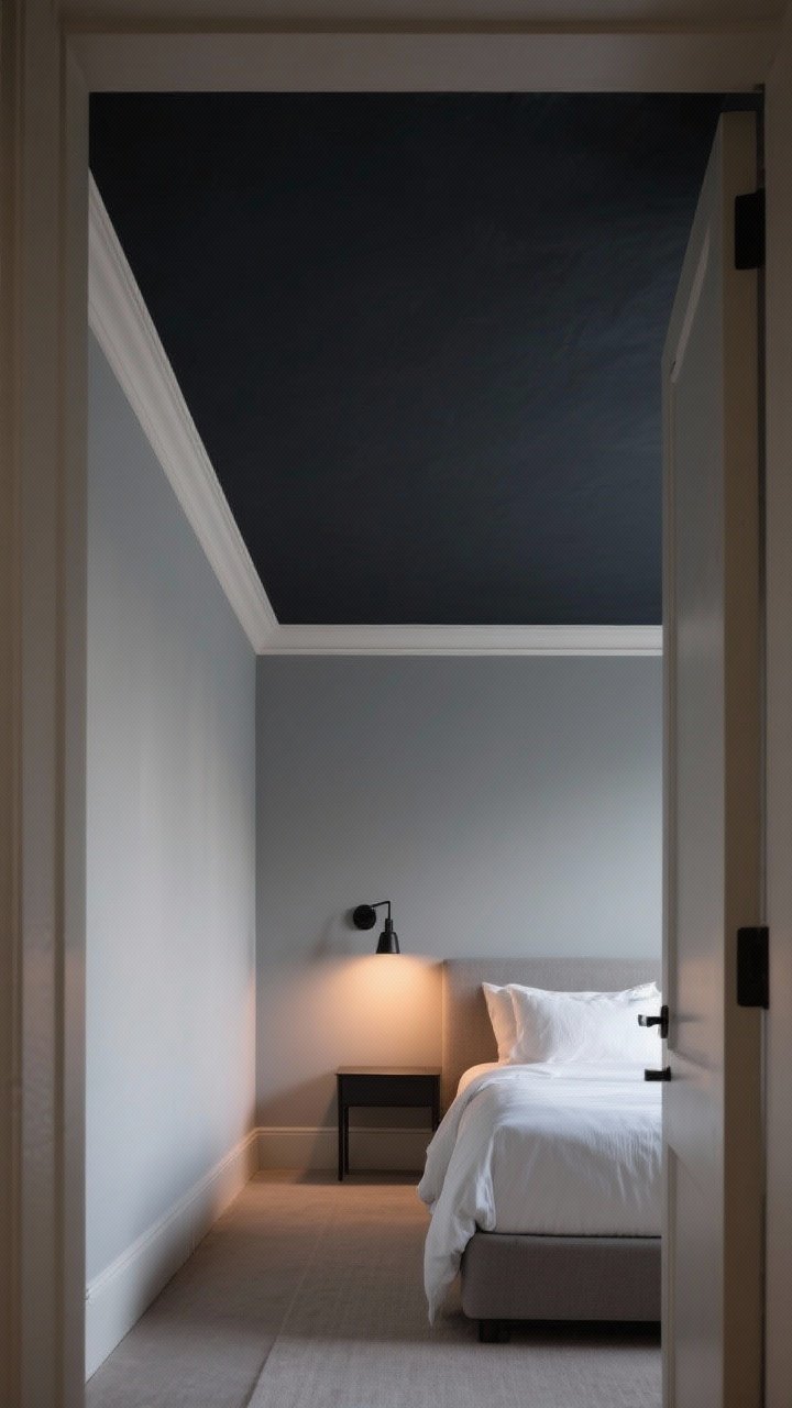
Stop ignoring the ceiling. A painted ceiling makes a room feel designed, not default. Go tonal—one shade darker than your walls—or go bold and make it a feature.
Choose Your Strategy
- Tonal cocoon: Walls soft gray, ceiling deep charcoal for cozy vibes.
- High-contrast pop: White walls, emerald or dusty rose ceiling. Drama, but tasteful.
- Frame it: Add a 2–3 inch border where the ceiling meets the wall in a lighter shade for a crisp, tailored look.
Application Tips
- Use flat or matte finishes to hide roller marks and imperfections.
- Extend color 2–4 inches down the wall to blur crooked edges and elongate the room.
- Light matters: Cool tones recede (feel taller), warm tones advance (feel cozier). Choose your illusion.
5. The Subtle Stencil Wall That Doesn’t Scream 2010
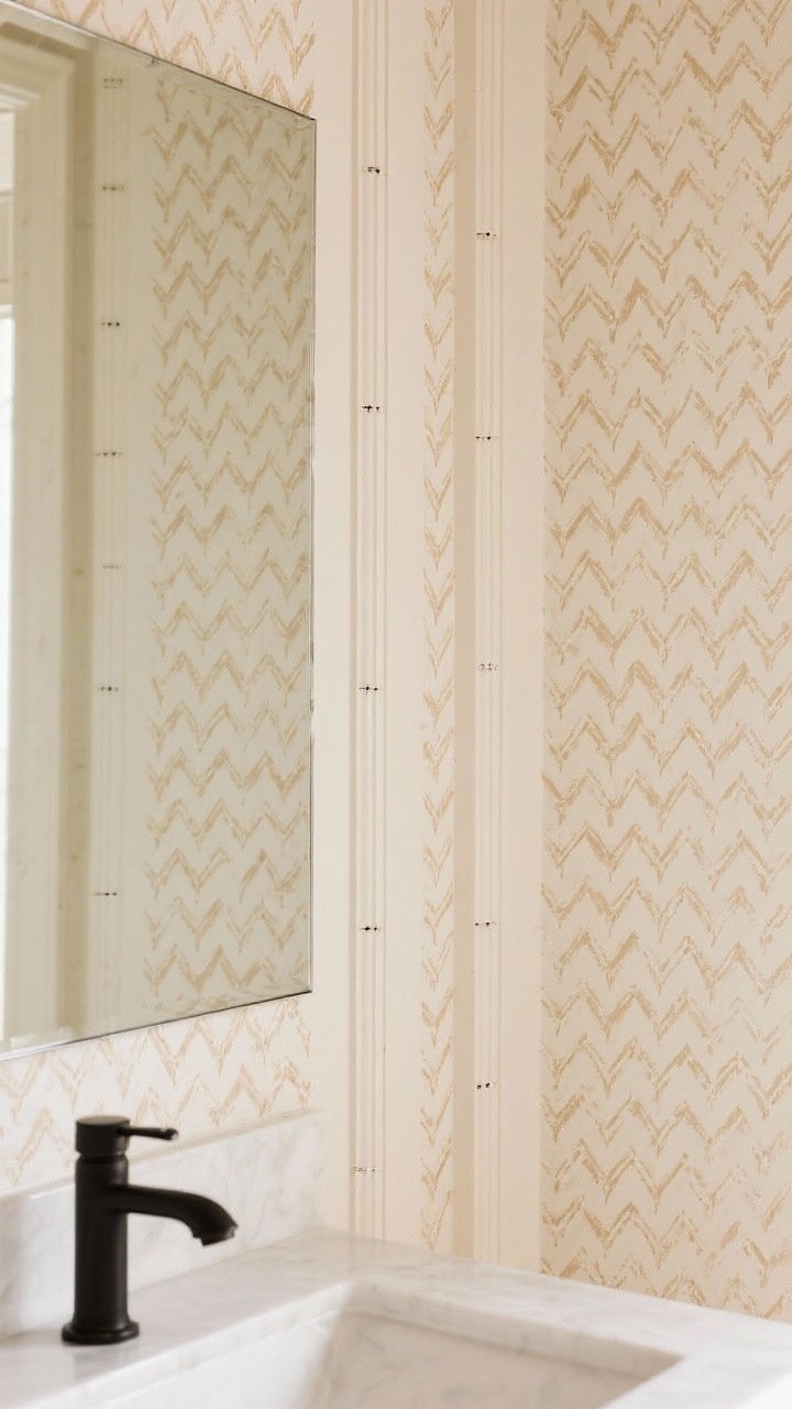
Hear me out: stencils, but make it chic. Think micro-patterns in tone-on-tone shades—like a soft herringbone, tiny dots, or a delicate arch motif. The effect is wallpaper-adjacent without the commitment or the tears.
How To Nail It
- Pick the right stencil: Smaller, modern patterns feel elevated. Skip anything too ornate unless that’s your whole vibe.
- Use a stencil brush or foam roller: Offload most paint onto a paper towel first. Dry brushing prevents bleed.
- Work in columns: Align registration marks carefully so it stays straight across the wall.
- Go tone-on-tone: Base coat and pattern should be within 1–2 shades for that subtle texture.
Where It Shines
- Entryways: Instant “wow” moment in a small space.
- Behind beds: Fake a headboard with a stenciled panel and a painted border.
- Powder rooms: Chic, wipeable, and renter-friendly if you keep it neutral.
Quick Supply Checklist
- Painter’s tape, drop cloths, sanding block
- Rollers, angled brush, stencil brush
- Bonding primer, matte/eggshell paint, sealer for furniture
- Level, measuring tape, ladder, and a playlist that slaps
Final pep talk: Your home should feel like you—bold, cozy, a little unexpected. Start small, test colors, and remember paint is reversible. Worst case? You learn something and try again. Best case? Your friends ask for your “designer’s” number. Go make something gorgeous.